Grobud Branding and Mobile App Design
For the Creative Leadership course for the M.A in Communication Design (HMKW, Berlin) I worked with two entreperneurs to develop the brand and some collaterals for their home aeroponics crop growing machine.

For the Creative Leadership course for the M.A in Communication Design (HMKW, Berlin) I worked with two entreperneurs to develop the brand and some collaterals for their home aeroponics crop growing machine.

The process of growing vegetables with an aeroponics machine can seem daunting to some and too technological for others. The product creators wanted to have a brand that wouldn't galvanize potential users, but rather invite all city-dwellers to live in a more sustainable way, finding in Grobud the perfect companion to do so.
In order to communicate values like friendliness, natural, and low-risk I explored organic shapes reminiscent of soil and stems. For the name I created a word formed by grow and buddy, effectively transmit the core values of the product, but when spoken out loud sound like robot reminding that this is still a tech product.

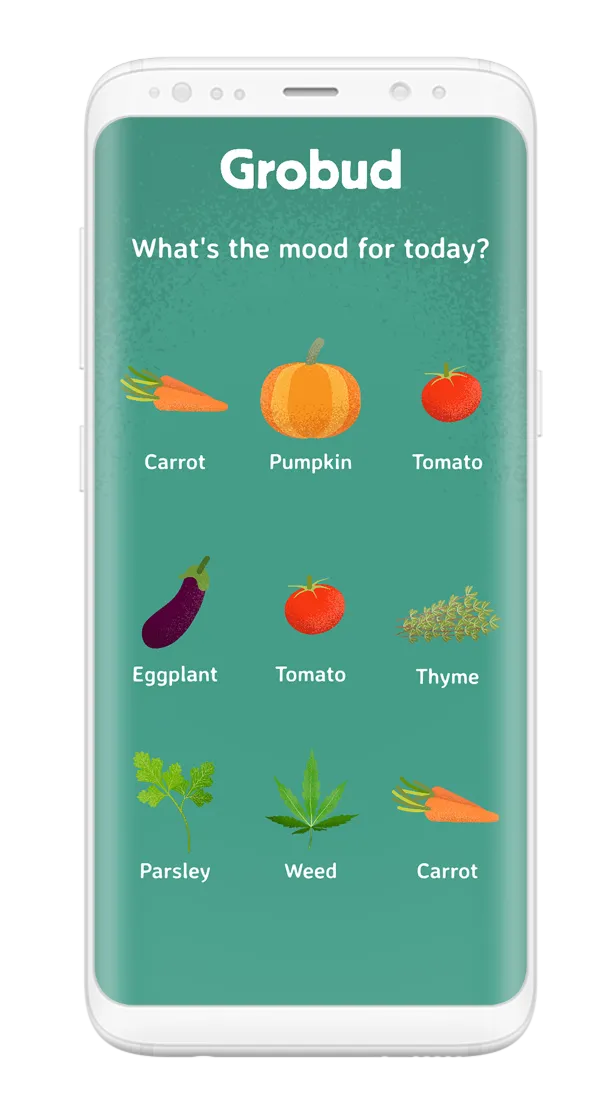
While I was defining the logo, different ideas for the look of the supporting graphics became clear. Illustrations for the veggies seemed like the correct way to go. I scrapped clean minimalistic illustrations or high-res perfect photographed veggies, for grainy "covered-in-soil" type of textures reinforcing the idea that this is a product that will produce real food.

The brand came alive organically – no pun intended. The name and logo shapes allowed themselves to be paired with light-hearted and cheeky statements, and through these statements I found the voice of the brand.


There was no information available on how the process from "seed to harvest" works. So, onboarding screens or beginner's instructions were not a possibility. Instead a simple set of flows for initiated users was designed and with it high-fidelity visuals for the mobile application that connects to the aeroponic growing machine.
These flows cover crucial actions taken inside the app, like:
Two prototypes were created to demonstrate how the technical aspects of growing a crop can be married with the less-technical brand language.


